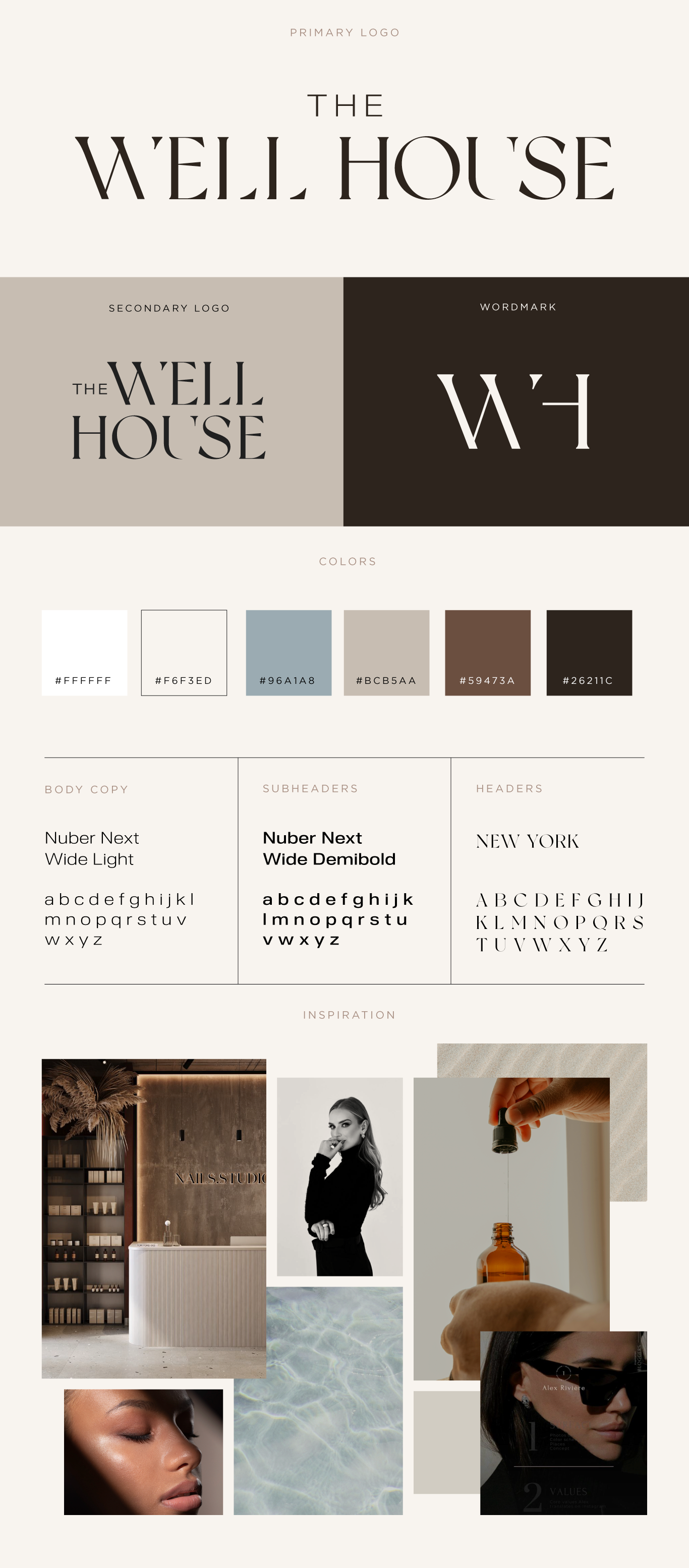
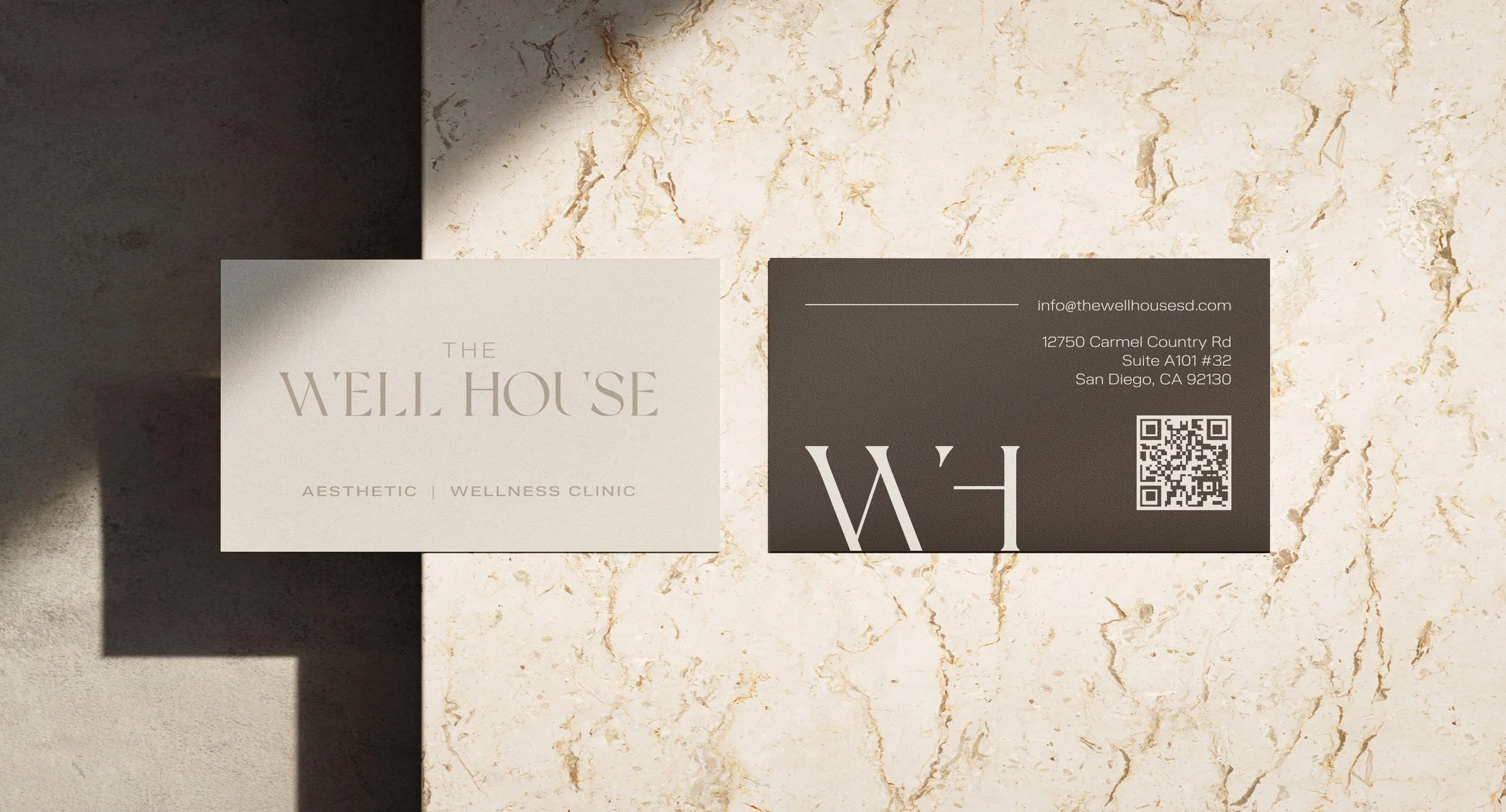
The Well House
BRANDING & IDENTITY ART DIRECTION & DESIGNChallenge: Develop a brand identity for a medspa offering aesthetic wellness treatments such as Botox, filler, and IV therapy—striking a balance between luxury and approachability to appeal to women ages 20–50 without feeling intimidating or excessive.
Approach: The client initially wanted to emphasize the IV aspect of the spa with a waterdrop motif. We decided this felt too literal and visually complicated, so I opted for a simpler, cleaner approach. I paired a traditional serif typeface—modified with subtle cuts for uniqueness—with a neutral, nature-inspired color palette to balance luxury with approachability. These calming tones also help ease clients' nerves during treatments.
Outcome: The final identity conveys contemporary elegance and warmth, connecting the spa’s aesthetic to natural beauty. The client loved it, saying it perfectly captured the vibe they were looking for.